Adobe Launch Page View Count Condition to Fire Tag

session_page_view_count_adobe_launch_rule_condition

You are given a 3rd party pixel tag from Facebook or Google and asked to fire the tags when the visitor has viewed 3 pages. Or you have an email capture overlay and you don’t want to distract your visitor when they land on your site on the first page view. Adobe Launch has built in functionality to track the session page view count and let’s you fire a tag when the visitor has 3 page views (or how every many page views you want).

Continue Reading

Google Analytics Real-Time Data Studio Dashboard

google_analytics_real-time_data_studio_dashboard_zoom

This tutorial shows you how to create a real-time Google Analytics Data Studio dashboard. The real-time Google Analytics data is fed to Google Data Studio via a Google Sheet. The Google Sheet uses Google App Script to query the Google Analytics real-time API. The Google Data Studio dashboard is automatically updated using a Chrome browser extension.

How it Works Flow Chart

Google Analytics Real-Time API > Google App Script > Google Sheet > Google Data Studio Sheets Connector > Google Data Studio Dashboard > Refresh Automatically using Data Studio Auto Refresh Chrome Extension

Continue Reading

Drift Chat Interaction Google Analytics Tracking Using GTM

This guide shows you how to track Drift chat widget interactions and email captures in Google Analytics using Google Tag Manager (GTM). The tutorial will show you how to capture the following Drift interactions in Google Analytics events:

1) Drift chat widget is opened and closed
2) Drift chat widget sidebar is opened and closed
3) A user’s email address is captured in a conversation in the Drift chat widget
4) A conversation started and a message sent along with the Drift conversation id

After you’ve captured the Drift interactions in GTM you’ll learn how to pass this data to Google Analytics and view the aggregate reports. You’ll then go a step further and analyze an individual user journey in Google Analytics and see the Drift chat interactions in chronological order together with the user’s other site behaviors.

Continue Reading

Pardot iFrame Form Tracking with Google Analytics

pardot_iframe_form_tracking_google_analytics

This guide shows you how to track Pardot form submissions completed in an iFrame in Google Analytics. The method described allows you to properly attribute the acquisition traffic source and medium to the conversion- the Pardot lead form submission in Google Analytics. You can also see what page on your site the Pardot iFrame lead form was submitted on using this tutorial.

Continue Reading

R Heatmap Tutorial for Google Analytics

heatmap_scroll_depth_page_google_analytics_R_last_365days_

This is a tutorial on how to create heatmap data visualizations using R. The data source used to construct the heatmaps in this example is Google Analytics R.

You will learn how to create two heatmaps in this tutorial:
        Hourly session data by day heatmap
        Page scroll depth heatmap

Continue Reading

Google Analytics R Tutorial

google_analytics_r_tutorial_et

This is a tutorial on how to use R to directly connect to and extract data from Google Analytics using the Google Analytics Reporting API v4. This is meant to be a simple example and assumes no prior knowledge or experience with R, APIs or programming.

I’ve included a video that walks you through each step of the process. You will be up and running in a few minutes. By the end of this tutorial you will be able to:

•Extract page view data for your top pages from Google Analytics Reporting API to R.
•Create a line graph showing session trended by day using R.

Continue Reading

Digital Analytics Data Quality- Your First Lesson

data-quality-digital-analytics

Make sure you are very confident in the accuracy of your data before you present it to stakeholders.

Eager Young Digital Analyst Meet the Data Quality Mousetrap

Almost 9 years ago when I was first starting out in my career in digital analytics I was tasked with an analysis of an internal search tool. It was one of those sites that had a bunch of filtering options for search. The visitor could select sizes, colors, product categories, and many other product attributes. I dove head first into the web analytics tool and started to explore the data. I quickly found what I thought was a smoking gun. According to the data, the insight I discovered was that the only internal search filtering option that visitors used was the color filter.

I presented two recommendations in my PowerPoint analysis:
1) Simplify the filtering and just keep the color filter
OR
2) Highlight the other filtering options like size, product category etc. to get visitors to use other filters

Read the story of how I found my career as a digital analyst on Craigslist.

Digital Analyst Meet the Debugger

Continue Reading

Scroll Depth Tracking Analysis with Google Analytics R

scroll_depth_google_analytics_percent_page_viewed_R

71% of pageviews to my post on automated Google Analytics cost import scroll 50% of the page and 41% of pageview reach the comments section. This is a tutorial on how to make the scroll depth tracking report above using the googleAnalyticsR package.

Scroll depth reporting gives you insight into how users are engaging with your content. How far down the page do visitors scroll? With the out of the box Google Analytics implementation there is no way to know.

Continue Reading

Google Analytics Cost Data Import from Google Sheets – Automated

This tutorial shows how to import Google Analytics cost data automatically from Google Sheets with the click of a button. Here is the sample sheet. Go to the File – Make a Copy to edit the sheet in your Google Drive.

Continue Reading

Apple Health Data How to Export Analyze Visualize Guide

apple_health_kit_steps_by_day_of_week_r_graph

Introduction

Did you know that the Apple Health App is recording your steps, mileage, and flights climbed data? This post will show you how to export, analyze and visualize your Apple Health data using both Excel and R. But first let’s establish that you may be sitting on a mountain of personal fitness data on your iPhone without even knowing it.

Send me your Apple Health export.xml file and I’ll analyze your fitness data for you.

Contents
Introduction
Export Apple Health App Data
Transform Apple Health XML to CSV
Analyze and Visualize Apple Health Data in Excel
Analyze and Visualize Apple Health Data in R

On iPhones 5s and newer and iOS 8 and newer, the health data is automatically collected as long as you have your iPhone with you when you are walking, running or hiking. Senors on the iPhone including the gyroscope, accelerometer, GPS, and barometer are used to measure steps, miles and flights climbed. To access the Apple Health data find and tap the heart health icon in your applications shown below. Your quantified self data is already being captured and you may not even know it.

AppleHealth_icon_

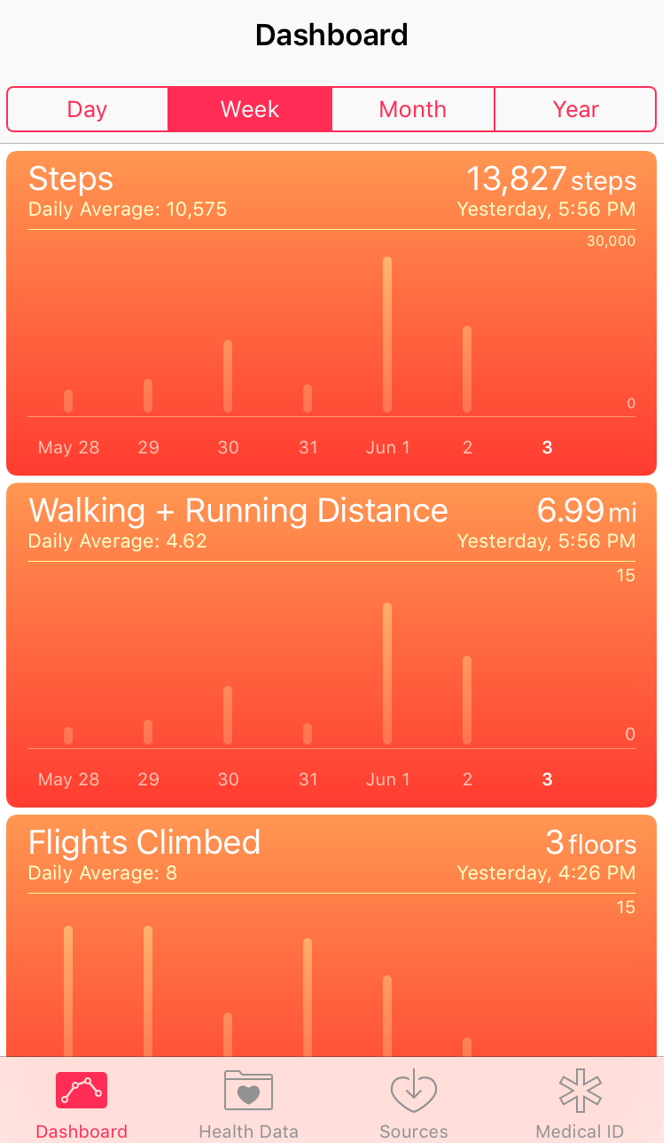
By default your Health dashboard should launch. If not tap the Dashboard icon on the bottom navigation. The dashboard will look like the screen shot shown below.

apple_health_dashboard

If you tap on any of the graphs twice, the first tap will bring you to a screen with a graph of just the single metric i.e. steps, and the second tap will launch a detailed table view of the data by day. This gives a nice quick view of your health data, but it makes it difficult to answer questions such as:

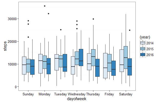
How do my steps this month compare to the same month to last year?
Am I more or less active on the weekdays or weekends?

The boxplot below shows my steps data by day of the week by year. This visualization was created using R and is just one example of what you will learn to create in this post.

apple_health_kit_steps_by_day_of_week_r_graph

This post will show you how to answer these questions and get started exporting, analyzing and visualizing your Apple Health steps, walking and running distance and flights climbed data.

Continue Reading