This is a tutorial on how to create heatmap data visualizations using R. The data source used to construct the heatmaps in this example is Google Analytics R.
You will learn how to create two heatmaps in this tutorial:
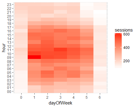
Hourly session data by day heatmap
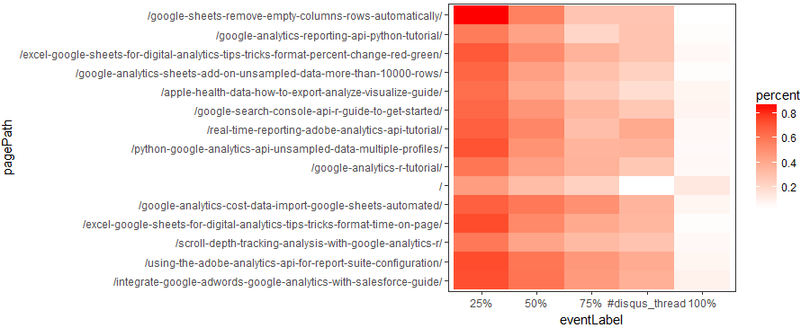
Page scroll depth heatmap
1. Google Analytics R Beginner Tutorial
If you haven’t used Google Analytics and R before please check out my beginner tutorial which includes a video. You will be up and running in minutes.
2. Hourly Sessions by Day Heatmap
What day of the week and hour of the day do I get the most traffic to my website?
Let’s use R to create a heatmap of sessions by hour by day of the week to answer this question.
The heatmap data visualization above was created with ggplot2 and shows the last 365 days of session data from Google Analytics broken out by hour and day of the week for www.ryanpraski.com. The majority of the traffic to my website visits on weekdays (1-5 is Monday through Friday, 0 is Sunday and 6 is Saturday). Also, not surprisingly the most popular hours of the day are between 8am and 5pm Eastern US Time. Interestingly, there is some traffic volume at 4am and 5am Eastern US Time on Tuesdays and Thursdays. This is likely from European visitors as a decent amount of traffic to my blog comes from Europe.
The R Code below will generate the hourly sessions by day heatmap for your Google Analytics sessions data in the plots pane in the bottom right panel of R Studio.
Day of Week Name Instead of Number on Heatmap X-Axis
A reader asked how to show the day of week name instead of the day of week number in the hourly sessions by day heatmap. Below is the heatmap R code with one additional line that adds the day of week names.
#heatmap ggplot
df1 %>%
  ggplot(aes(x=dayOfWeek, y=hour, fill=sessions)) +
  geom_tile() +
  scale_fill_continuous(low = 'white', high = 'red') +
  scale_x_discrete(labels = c('Sunday','Monday', 'Tuesday', 'Wednesday', 'Thursday', 'Friday', 'Saturday'))
3. Page Scroll Depth Tracking Heatmap
How engaged are visitors with pages on my website?
Are visitors scrolling down the page and reading my content?
To answer these questions let’s use R to create a heatmap showing the percentage of pageviews that hit each page milestone 25%, 50%, 75%, 100% and the top of the comments section (disqus_thread). I wrote about reporting and analyzing the scroll depth data in R in a previous post that you should check out as well. In this example I am just going to focus on how to visualize this page scroll depth data in a heatmap.
The heatmap above shows the top 15 pages by pageviews on my web site showing the percent of pageviews that reached each 25%, 50%, 75%, the top of the comments (#disqus_thread) and 100% of the page. The R script to produce this heatmap visualization is below with comments including in the code.
Tutorial Complete- Here are Other Useful Google Analytics API Resources to Explore
Create a heatmap with different combination of Google Analytics dimensions and metrics. Use the Google Analytics dimension and metrics combination explorer to see the dimension and metric names and valid combinations for the Google Analytics reporting API v4.
Check out my tutorial on how to pull Google Search Console data using R.
If you are a Python user check out my tutorial showing you how to pull your first query using the Google API Python library.
See the examples provided by the googleAnalyticsR author Mark Edmondson.
If you have any questions or need help getting creating these Google Analytics heatmaps in R let me know in the chat or comments below.

