Introduction
Did you know that the Apple Health App is recording your steps, mileage, and flights climbed data? This post will show you how to export, analyze and visualize your Apple Health data using both Excel and R. But first let’s establish that you may be sitting on a mountain of personal fitness data on your iPhone without even knowing it.
Send me your Apple Health export.xml file and I’ll analyze your fitness data for you.
Contents
Introduction
Export Apple Health App Data
Transform Apple Health XML to CSV
Analyze and Visualize Apple Health Data in Excel
Analyze and Visualize Apple Health Data in R
On iPhones 5s and newer and iOS 8 and newer, the health data is automatically collected as long as you have your iPhone with you when you are walking, running or hiking. Senors on the iPhone including the gyroscope, accelerometer, GPS, and barometer are used to measure steps, miles and flights climbed. To access the Apple Health data find and tap the heart health icon in your applications shown below. Your quantified self data is already being captured and you may not even know it.
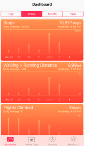
By default your Health dashboard should launch. If not tap the Dashboard icon on the bottom navigation. The dashboard will look like the screen shot shown below.
If you tap on any of the graphs twice, the first tap will bring you to a screen with a graph of just the single metric i.e. steps, and the second tap will launch a detailed table view of the data by day. This gives a nice quick view of your health data, but it makes it difficult to answer questions such as:
How do my steps this month compare to the same month to last year?
Am I more or less active on the weekdays or weekends?
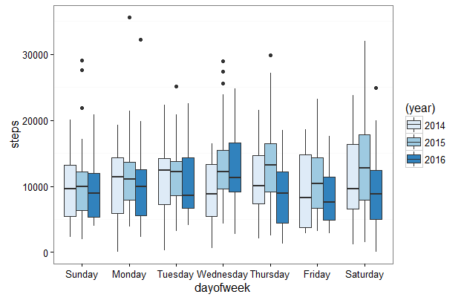
The boxplot below shows my steps data by day of the week by year. This visualization was created using R and is just one example of what you will learn to create in this post.
This post will show you how to answer these questions and get started exporting, analyzing and visualizing your Apple Health steps, walking and running distance and flights climbed data.
How to Export Apple Health App Data
1) Launch the Apple Health App on your iPhone
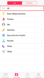
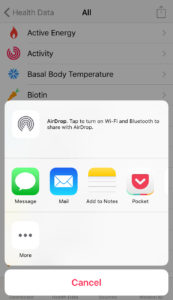
2) Tap the Health Data icon in the bottom navigation. This will launch a list of all your Apple Heath data. In the List view, tap the “All” item which is the first item in the list.
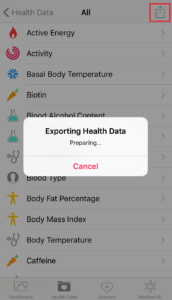
3) Tap the send arrow icon in the top right. This will launch an alert that says “Exporting Health Data Preparing…” The export preparation took 4 minutes for my health data, so be patient.
4) Once the data is ready to send you’ll see an overlay where you can select how to send the health data export. I chose to send the file via email. The file name is export.zip.
5) Download the export.zip file (my file was 4.3 MB). Then unzip the file. After you unzip you should see two files: export.xml (my file was 100 MB) and export_cda.xml. For this analysis we will just use the export.xml. Extract and save your export.xml file to a new folder. I called my folder apple_health_data and the folder is on the desktop.
Open the export.xml file in a text editor and at the very top you’ll see header info. When you scroll down in the file you’ll see your health data with records for step count, flights climbed and distances walking/running. See the below examples of single record rows for each of the three different standard iPhone Apple Health data points. If you scroll all the way to the right below you’ll see the creationDate, startDate, endDate, and value (steps, distance, flights).
<Record type="HKQuantityTypeIdentifierStepCount" sourceName="Ryan Praskievicz iPhone" sourceVersion="9.3.2" device="<<HKDevice: 0x161133700>, name:iPhone, manufacturer:Apple, model:iPhone, hardware:iPhone8,1, software:9.3.2>" unit="count" creationDate="2016-05-21 17:05:28 -0400" startDate="2016-05-21 16:57:01 -0400" endDate="2016-05-21 16:58:02 -0400" value="113"/> <Record type="HKQuantityTypeIdentifierFlightsClimbed" sourceName="Ryan Praskievicz iPhone" sourceVersion="9.3.2" device="<<HKDevice: 0x1610281c0>, name:iPhone, manufacturer:Apple, model:iPhone, hardware:iPhone8,1, software:9.3.2>" unit="count" creationDate="2016-05-21 17:05:29 -0400" startDate="2016-05-21 16:33:59 -0400" endDate="2016-05-21 16:33:59 -0400" value="1"/> <Record type="HKQuantityTypeIdentifierDistanceWalkingRunning" sourceName="Ryan Praskievicz iPhone" unit="mi" creationDate="2015-05-21 16:16:04 -0400" startDate="2015-05-21 16:03:05 -0400" endDate="2015-05-21 16:08:05 -0400" value="0.315027"/>
Now that you have a full export of all your Apple Kit Health data you will need to transform the XML data into a CSV file for analysis.
How to Transform your Apple Health Data from XML to CSV
To transform your Apple Health export.xml data to a useable CSV format we will use a Python script. The Python script will take the export.xml file and create three CSV files with your Apple Health data: StepCount.csv, DistanceWalkingRunning.csv, FlightsClimbed.csv.
If Python isn’t your jam you can also use this web based Apple Health XML to CSV Converter.
If you are going to use R to analyze and visualize your Apple Health data, you can skip this Python XML to CSV data transformation step. The R script will transform and load your Apple Health XML data into an R data frame for analysis.
1) Copy and save the Python script below as applehealthdata.py in the apple_health_data folder we created previously. The Python script needs to be saved in the same folder as the export.xml file. Thanks to the Test-Driven data analysis blog for creating this Python Script.
"""
applehealthdata.py: Extract data from Apple Health App's export.xml.

Copyright (c) 2016 Nicholas J. Radcliffe
Licence: MIT
"""
from __future__ import absolute_import
from __future__ import division
from __future__ import print_function
from __future__ import unicode_literals

import os
import re
import sys

from xml.etree import ElementTree
from collections import Counter, OrderedDict

__version__ = '1.0'

FIELDS = OrderedDict((
    ('sourceName', 's'),
    ('sourceVersion', 's'),
    ('device', 's'),
    ('type', 's'),
    ('unit', 's'),
    ('creationDate', 'd'),
    ('startDate', 'd'),
    ('endDate', 'd'),
    ('value', 'n'),
))

PREFIX_RE = re.compile('^HK.*TypeIdentifier(.+)$')
ABBREVIATE = True
VERBOSE = True

def format_freqs(counter):
    """
    Format a counter object for display.
    """
    return '\n'.join('%s: %d' % (tag, counter[tag])
                     for tag in sorted(counter.keys()))


def format_value(value, datatype):
    """
    Format a value for a CSV file, escaping double quotes and backslashes.

    None maps to empty.

    datatype should be
        's' for string (escaped)
        'n' for number
        'd' for datetime
    """
    if value is None:
        return ''
    elif datatype == 's':  # string
        return '"%s"' % value.replace('\\', '\\\\').replace('"', '\\"')
    elif datatype in ('n', 'd'):  # number or date
        return value
    else:
        raise KeyError('Unexpected format value: %s' % datatype)


def abbreviate(s):
    """
    Abbreviate particularly verbose strings based on a regular expression
    """
    m = re.match(PREFIX_RE, s)
    return m.group(1) if ABBREVIATE and m else s


def encode(s):
    """
    Encode string for writing to file.
    In Python 2, this encodes as UTF-8, whereas in Python 3,
    it does nothing
    """
    return s.encode('UTF-8') if sys.version_info.major < 3 else s


class HealthDataExtractor(object):
    """
    Extract health data from Apple Health App's XML export, export.xml.

    Inputs:
        path:      Relative or absolute path to export.xml
        verbose:   Set to False for less verbose output

    Outputs:
        Writes a CSV file for each record type found, in the same
        directory as the input export.xml. Reports each file written
        unless verbose has been set to False.
    """
    def __init__(self, path, verbose=VERBOSE):
        self.in_path = path
        self.verbose = verbose
        self.directory = os.path.abspath(os.path.split(path)[0])
        with open(path) as f:
            self.report('Reading data from %s . . . ' % path, end='')
            self.data = ElementTree.parse(f)
            self.report('done')
        self.root = self.data._root
        self.nodes = self.root.getchildren()
        self.n_nodes = len(self.nodes)
        self.abbreviate_types()
        self.collect_stats()

    def report(self, msg, end='\n'):
        if self.verbose:
            print(msg, end=end)
            sys.stdout.flush()

    def count_tags_and_fields(self):
        self.tags = Counter()
        self.fields = Counter()
        for record in self.nodes:
            self.tags[record.tag] += 1
            for k in record.keys():
                self.fields[k] += 1

    def count_record_types(self):
        self.record_types = Counter()
        for record in self.nodes:
            if record.tag == 'Record':
                self.record_types[record.attrib['type']] += 1

    def collect_stats(self):
        self.count_record_types()
        self.count_tags_and_fields()

    def open_for_writing(self):
        self.handles = {}
        self.paths = []
        for kind in self.record_types:
            path = os.path.join(self.directory, '%s.csv' % abbreviate(kind))
            f = open(path, 'w')
            f.write(','.join(FIELDS) + '\n')
            self.handles[kind] = f
            self.report('Opening %s for writing' % path)

    def abbreviate_types(self):
        """
        Shorten types by removing common boilerplate text.
        """
        for node in self.nodes:
            if node.tag == 'Record':
                if 'type' in node.attrib:
                    node.attrib['type'] = abbreviate(node.attrib['type'])


    def write_records(self):
        for node in self.nodes:
            if node.tag == 'Record':
                attributes = node.attrib
                kind = attributes['type']
                values = [format_value(attributes.get(field), datatype)
                          for (field, datatype) in FIELDS.items()]
                line = encode(','.join(values) + '\n')
                self.handles[kind].write(line)

    def close_files(self):
        for (kind, f) in self.handles.items():
            f.close()
            self.report('Written %s data.' % abbreviate(kind))

    def extract(self):
        self.open_for_writing()
        self.write_records()
        self.close_files()

    def report_stats(self):
        print('\nTags:\n%s\n' % format_freqs(self.tags))
        print('Fields:\n%s\n' % format_freqs(self.fields))
        print('Record types:\n%s\n' % format_freqs(self.record_types))


if __name__ == '__main__':
    if len(sys.argv) != 2:
        print('USAGE: python applehealthdata.py /path/to/export.xml',
              file=sys.stderr)
        sys.exit(1)
    data = HealthDataExtractor(sys.argv[1])
    data.report_stats()
    data.extract()
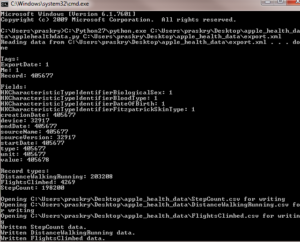
2) You will have to run the applehealthdata.py Python script via the command line. To open the command line on Windows click Start > Run > cmd or search for and run cmd. To run the script you need to enter: #1 path to Python #2 path to applehealth.py script #3 path to the export.xml file then press enter. You can see the path to each of these three items on my computer below.
C:\Python27\python.exe C:\Users\praskry\Desktop\apple_health_data\applehealthdata.py C:\Users\praskry\Desktop\apple_health_data\export.xml
Let the script run. If everything is successful you will see summary statistics in the command line showing the count for the fields and records included in your CSV files. You’ll also see the path for your three Apple Health data CSV files. The StepCount.csv, DistanceWalkingRunning.csv, and FlightsClimbed.csv files are written to the apple_health_data folder (directory).
Below is a screen shot of the StepCount.csv file opened in Excel.
StepCount.csv Fields and Sample Data
- sourceName – Ryan Praskievicz iPhone
- sourceVersion – 9.3.2
- device – <<HKDevice: 0x161169930>, name:iPhone, manufacturer:Apple, model:iPhone, hardware:iPhone8,1, software:9.3.2>
- type – StepCount
- unit – count
- creationDate – 6/1/2016 7:22:22 PM
- startDate – 6/1/2016 7:06:51 PM
- endDate – 6/1/2016 7:07:52 PM
- value – 125
How to Analyze and Visualize your Apple Health Data in Excel
The Apple Health Dashboard view is great for getting a quick snap shot of daily, weekly, monthly and yearly data on Steps, Distance, and Flights climbed. To explore the underlying data for each graph you can tap the graph and see a table of daily totals for your health metrics. One drawback of viewing the data in the health app is that if you choose a monthly or yearly graph view, when you drill into the table view, the underlying data is still shown with daily granularity (not monthly or yearly). This makes it difficult to do comparisons month over month. You can eyeball the health kit graph and see that it looks like your total number of steps this month are greater than your total steps last month, but it is hard to know any more specific details. Digging deep gives you better insight into your quantified self data.
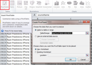
1) As a first step let’s use Excel to recreate the Apple Health dashboard and enhance the visualization and data table to give us a more detailed view of our steps. Open your StepCount.csv file and go to the Insert Tab and click PivotTable. Excel should be able to preselect your steps data set including the headers with the PivotTable Wizard.
2) Now that we’ve defined the source data for our PivotTable let’s select the fields we are interested in for analysis. From the PivotTable Field List choose endDate and value. The endDate should be in the PivotTable Row Labels and the Sum of value should be in the PivotTable Values. You should now see a PivotTable with with date time stamps in the first column and steps in the second column.
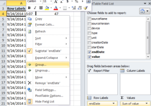
3) We are interested in seeing the data by month, so we need to aggregate the multiple rows per day of step measurements into monthly step data for each year. Right click on the PivotTable data and click on Group as shown in the screen shot below.
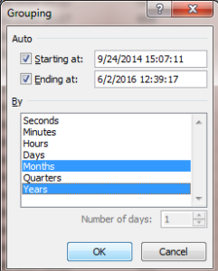
When you click on the Group… link shown above this will open a Grouping dialog box. For your Grouping choose Months and Years and click Ok as shown in the screen shot below.
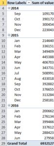
You should now see a PivotTable showing your steps data by month for each year. The first full month of steps data for me was October 2015.
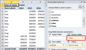
4) Let’s reorganize the PivotTable to make it easier to compare the Steps data by month year over year. In the PivotTable Field List click on Years under the Row Labels and drag Years to Column Labels. See the screen shot below showing the PivotTable data now organized with Months in the Rows and Years in the Columns.
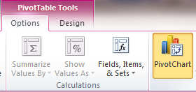
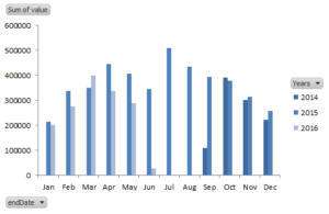
5) Now let’s add a graph showing steps data by month that let’s you easily compare year over years data. Click anywhere on your PivotTable to activate the PivotTable Tools context menu, then click on PivotChart to add a graph. I chose the default bar graph.
When you insert the PivotChart you will see a graph similar to the graph below (I used the blue scale chart design and removed the grid lines to clean the graph up). This graph and the PivotTable now make it easy to compare my Apple Health steps data month over month by year.
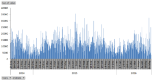
6) To view all of your step data by day Group the PivotTable data by Day and Year. Then to see a graph with all of your steps data add the PivotChart and make sure that Years and endDate are both in the Axis Field. All of my daily Apple Health Step data is shown in the graph below.
How to Analyze and Visualize your Apple Health Data using R
Using R to analyze and visualize your Apple Health data gives a repeatable programmatic option compared to Excel. No previous programming experience or R knowledge is required for this tutorial, just like the other tutorials on my blog. I walk you through an R script that you can use to analyze your Apple Health data.
1) First you need to download and install R.
2) Next you have to Install R Studio. R Studio is an integrated development environment (IDE) which is the interface you’ll write, run and interact with your code. R Studio has a set of tools to make it easier to work with R.
3) Launch R Studio and install the R packages we will use in this tutorial: dplyr , ggplot2 , lubridate, and XML. In the Console module in R Studio (the bottom left pane) run the code below. Copy and paste or type the code shown below and press enter. This will install the packages via an online package repository called the Comprehensive R Archive Network or CRAN.
Once these packages have installed successfully you’ll see a message in the console that says “package successfully installed…”
4) Download and Run the Apple Health R Analysis Script
Save or copy the script below to your computer and open it in RStudio. In RStudio in the top left pane you’ll see the code, click on the Source button in the top right of the code pane. This will run the entire script. You’ll see tables and information printed to the R Console in the bottom left pane and you’ll see a heatmap in the bottom right Plots pane. To page through the visualization click on the forward and backward arrows above the Plots. This R script will produce 4 plots.
In the rest of the post I’ll walk you through each section of the code. To run a section of the code instead of the entire script, highlight the lines of code and click the Run button next to the Source button in the top right of the code pane.
5) Load the export.xml data into a data frame in R make sure to specify the path to the file on your computer on line 7.
Line 18 of the code converts the endDate 2016-06-02 12:27:46 -0400 into a type of POSIXct format variable that accounts for the time zone. I am in New York City so I set tz=”America/New_York” Check out the examples in the lubridate docs to see what you should set for your time zone.
In lines 22-26 we add month, year, date, day of week, and hour of day to our df data frame as new columns. This is important because the endDate for Apple Health measurements (Steps, Miles, Flights Climbed) can be as little as seconds apart so this granular data needs to be aggregated into a more manageable time range for analysis.
#load apple health export.xml file
xml <- xmlParse("C:\\Users\\praskry\\Desktop\\apple_health_data\\export.xml")

#transform xml file to data frame - select the Record rows from the xml file
df <- XML:::xmlAttrsToDataFrame(xml["//Record"])
str(df)

#make value variable numeric
df$value <- as.numeric(as.character(df$value))
str(df)

#make endDate in a date time variable POSIXct using lubridate with eastern time zone
df$endDate <-ymd_hms(df$endDate,tz="America/New_York")
str(df)

##add in year month date dayofweek hour columns
df$month<-format(df$endDate,"%m")
df$year<-format(df$endDate,"%Y")
df$date<-format(df$endDate,"%Y-%m-%d")
df$dayofweek <-wday(df$endDate, label=TRUE, abbr=FALSE)
df$hour <-format(df$endDate,"%H")
str(df)
6) Graph Steps by Month by Year in R Bar Graph
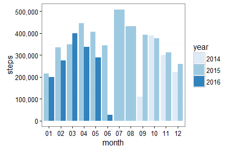
How do my steps this month compare to the same month last year? We need to aggregate our raw steps data by year and month to answer this question. The dplyr package group_by() function groups the steps data by year and month, two of the new columns we added to our df data frame in step 5 above. The summarize() function is one of the 5 “verbs” of the dplyr package. It is used with group_by() to summarize (verb), in this case sum our grouped steps data on line 33. The table below the code snippet which shows the aggregate steps data by year by month. This is printed to the console by the code on line 35.
Next let’s add a bar graph to visualize the steps data by year by month. We are going to use the ggplot2 package to create the bar graph. Define the plot aesthetics aes on line 37 setting the x axis data equal to the month and the y axis equal to the steps. The fill aesthetic is set equal to year so each year on the bar graph is filled with a different color. Next define the type of graph geom_bar() on line 38 and set position=’dodge’ to tell the yearly bars for each month to dodge (be placed next to each other) and stat=’identity’ is set to map the heights of the bars in the graph to the values of steps (the y axis data).
Rather than using the default color scale for the graph on line 40 I set scale_fill_brewer() to get a cleaner color scale. This sets a blue color scale with darker and lighter blues representing each year. Alternatively to use a grey scale you can set line 40 to scale_fill_grey()
To remove the grid lines to clean the graph up even more, on line 42 theme(panel.grid.major = element_blank()) sets the grid line panel element to blank. Finally, to make sure Steps are not shown as a number formatted in scientific notation on line 39 specify scale_y_continuous(labels = scales::comma)
Quick aside on pipes %>% and dplyr
Using pipes %>% and dplyr lets you chain functions together. Chaining functions allows you to avoid storing data in temporary data frames and simplifies your code. Pipes in the code are read as “then”. So reading through the code starring on line 30 below and putting it into words: we are telling R to take the df data frame then group the df data frame by year and month then summarize this grouped data by the sum of the steps then print the results then graph this monthly steps data by year by month.
#show steps by month by year using dplyr then graph using ggplot2
df %>%
  filter(type == 'HKQuantityTypeIdentifierStepCount') %>%
  group_by(year,month) %>%
  summarize(steps=sum(value)) %>%
  #print table steps by month by year
  print (n=100) %>%
  #graph data by month by year
  ggplot(aes(x=month, y=steps, fill=year)) +
  geom_bar(position='dodge', stat='identity') +
  scale_y_continuous(labels = scales::comma) +
  scale_fill_brewer() +
  theme_bw() +
  theme(panel.grid.major = element_blank())
Steps Data by Year by Month R Bar Graph
Some quick analysis of my monthly steps data. I had fewer steps per month the first 5 months of 2016 as compared to 2015 in all months except February. I have been biking more than walking and running so far in 2016 so this makes sense. Also, July 2015 I had over 500,000 steps. I was on a trip to Europe where I walked and hiked a bunch so that explains the spike.
Steps Data by Year by Month R Data Table
#Steps Data by Year and Month Output to R Console

  year month steps
  <chr> <chr> <int>
1  2014 09 109170
2  2014 10 390172
3  2014 11 300454
4  2014 12 223050
5  2015 01 214782
6  2015 02 336002
7  2015 03 349409
8  2015 04 445388
9  2015 05 406703
10 2015 06 343731
11 2015 07 508991
12 2015 08 433018
13 2015 09 392882
14 2015 10 376655
15 2015 11 313284
16 2015 12 258262
17 2016 01 200581
18 2016 02 276134
19 2016 03 399466
20 2016 04 337612
21 2016 05 288423
22 2016 06 27958
7) Graph Steps by Month by Year in R Boxplot
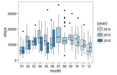
A boxplot is another more detailed option to visualize monthly steps data. The boxplot shows the variablity of the daily steps data for each month rather than just the totals by month shown in the bar graph. This allows us to dig deeper into our quantified self data. The code below should look similar to the steps data grouping and bar graph code above. The first difference in the boxplot code is that we now groupby() date as well as month and year on line 47 so we have our granular date level data underlying our boxplot. The second difference in the boxplot code is geom_boxplot(aes(fill=(year))) on line 52 which generates the boxplot instead of the bar graph.
Also, included starting on line 57 is code to generate the summary statistics for steps by month for 2015. This gives you mean, standard deviation, median, maximum, minimum, 1st Quartile, 3rd Quartile steps summary statistics for each month in a table form. The table gives you the chance to dig deeper on trends that you identify in the boxplot. The data table is output to the R Console and I’ve included my data below.
#boxplot data by month by year
df %>%
  filter(type == 'HKQuantityTypeIdentifierStepCount') %>%
  group_by(date,month,year) %>%
  summarize(steps=sum(value)) %>%
  #print table steps by date by month by year
  print (n=100) %>%
  ggplot(aes(x=month, y=steps)) +
  geom_boxplot(aes(fill=(year))) +
  scale_fill_brewer() +
  theme_bw() +
  theme(panel.grid.major = element_blank())

#summary statistics by month for 2015
df %>%
  filter(type == 'HKQuantityTypeIdentifierStepCount') %>%
  group_by(date,month,year) %>%
  summarize(steps=sum(value)) %>%
  filter(year==2015) %>%
  group_by(month) %>%
  summarize(mean = round(mean(steps), 2), sd = round(sd(steps), 2),
            median = round(median(steps), 2), max = round(max(steps), 2),
            min = round(min(steps), 2),`25%`= quantile(steps, probs=0.25),
            `75%`= quantile(steps, probs=0.75))
Steps Data by Year by Month R Boxplot
Extending the analysis of my monthly steps by year data from the bar graph, in the boxplot I can see the max steps data point of over 30k steps in July 2015. The outliers in the boxplot are denoted with dots. In the summary statistics table below the graph, the actual max number of steps for July 2015 was 35,582 steps. Also, in May 2015 my median 12,405 steps for the month was greater than the 3rd quartile of steps for May 2016 11,441 steps. This makes sense because I didn’t have my phone with me all day everyday in May 2016 due to a camping trip.
Steps Summary Statistics Data by Month for 2015 R Data Table
#Steps summary stats by month for 2015 Output to R Console

   month     mean      sd  median   max   min      25%     75%
   <chr>    <dbl>   <dbl>   <dbl> <dbl> <dbl>    <dbl>   <dbl>
1     01  6928.45 3499.36  5924.0 15173  2286  4007.00  8581.0
2     02 12000.07 5727.69 11977.5 22675  4097  6853.25 15649.5
3     03 11271.26 2579.44 11662.0 15199  6269  9723.50 12667.0
4     04 14846.27 5825.21 14257.0 25357  4445 10925.75 19322.0
5     05 13119.45 5139.61 12405.0 25031  2971  9829.50 16222.0
6     06 11457.70 5083.92  9904.5 25643  4301  7424.25 14225.0
7     07 16419.06 7369.98 14750.0 35582  4546 11243.50 20911.5
8     08 13968.32 6855.27 12189.0 32019  2897 10469.00 14561.0
9     09 13096.07 5272.44 12753.0 29838  5737 10155.50 15987.0
10    10 12150.16 5163.45 11227.0 27174  3906  8952.00 15359.5
11    11 10442.80 4405.78  9476.5 22683  3814  8233.75 12669.5
12    12  8331.03 3933.16  8098.0 15450  1556  5192.00 11396.5
8) Graph Steps by Day of Week by Year in R Boxplot
This is another boxplot which visualizes the day of week year over year. This is very similar to the previous boxplot with a few minor code changes. To create the boxplot by day of week instead of month use dayofweek in the groupby() on line 72 and in the ggplot() on line 76 we use dayofweek on our x axis instead of month.
Just like the previous boxplot there is code for steps summary statistics to be output to a table. The summary statistic table code starts on line 82. On line 93 arrange(desc(median)) sorts the median steps by day of week from greatest to least. This makes it easier to see what days of week you are most and least active.
#boxplot data by day of week year
df %>%
  filter(type == 'HKQuantityTypeIdentifierStepCount') %>%
  group_by(dayofweek,date,year) %>%
  summarize(steps=sum(value)) %>%
  #print table steps by date by month by year
  print (n=100) %>%
  ggplot(aes(x=dayofweek, y=steps)) +
  geom_boxplot(aes(fill=(year))) +
  scale_fill_brewer() +
  theme_bw() +
  theme(panel.grid.major = element_blank())

#summary statistics by day of week for 2015
df %>%
  filter(type == 'HKQuantityTypeIdentifierStepCount') %>%
  group_by(dayofweek,date,year) %>%
  summarize(steps=sum(value)) %>%
  filter(year==2015) %>%
  group_by(dayofweek) %>%
  summarize(mean = round(mean(steps), 2), sd = round(sd(steps), 2),
            median = round(median(steps), 2), max = round(max(steps), 2),
            min = round(min(steps), 2),`25%`= quantile(steps, probs=0.25),
            `75%`= quantile(steps, probs=0.75)) %>%
  arrange(desc(median))
Steps Data by Year by Day of Week R Boxplot
One thing that jumps out to me is that for 2015 Thursday 13,187 median steps and Saturday 12,724 median steps are the top two days of the week for 2015. Saturday in 2015 also has the greatest standard deviation of any day. This makes sense because there were Saturday’s in 2015 when I went on long hikes and some Saturdays when I relaxed and took days off from exercise. One other obeservation is the similarity year of year in steps on Sunday, Monday and Tuesday. The boxplots are all relatively similar for those 3 days with the major difference on Tuesday’s in 2016 with the median steps much lower than Tuesdays in 2014 and 2015.
Steps Summary Statistics Data by Day of Week for 2015 R Data Table
#Steps summary stats for day of week sorted by median for 2015 output to R Console

  dayofweek     mean      sd  median   max   min     25%      75%
     <fctr>    <dbl>   <dbl>   <dbl> <dbl> <dbl>   <dbl>    <dbl>
1  Thursday 13402.98 6274.18 13187.0 29838  2556 9184.00 16468.00
2  Saturday 13442.19 6944.57 12724.0 32019  1556 7967.75 17804.00
3 Wednesday 13440.52 5670.23 12228.5 28981  4271 9650.75 15412.25
4   Tuesday 11390.37 4135.22 12188.5 25089  3172 8553.25 13767.25
5    Monday 11409.23 5365.37 11128.0 35582  3831 7878.00 13622.25
6    Friday 10850.67 5146.30 10407.5 23185  3213 6695.75 14335.50
7    Sunday 10019.88 5495.54 10003.0 29030  1959 6362.75 12149.00
Bonus
I’ve added a heatmap visualization to the R Script starting on line 95. This heatmap shows your steps data visualized by day of week and hour of day. It is a nice way to see patterns in your daily activity.
Summary
I hope this post gave you the necessary tools to export, analyze and visualize your Apple Health Steps data. You should be able to apply the Excel analysis and the R sample code and analysis to the walking and running distance and the flights climbed CSV files to analyze those two data sets as well. To run the R script on miles walked/run data swap HKQuantityTypeIdentifierStepCount for HKQuantityTypeIdentifierDistanceWalkingRunning and for flights climbed data use HKQuantityTypeIdentifierFlightsClimbed. Hopefully this tutorial also helps you to understand the value of using R and other programmatic data analysis tools as compared to Excel. And my final wish is that by analyzing your Apple Health data, you take action. Go ahead and set goals for yourself, and use the quantified self data as motivation to be active.
Please share any questions, comments or ideas for deeper analysis of the Apple Health Kit data with me in the comments below, on Twitter @ryanpraski or email ryan@ryanpraski.com.
