
If an increase is good and a decrease is bad format percent change like this
[Green]▲ 0.00%;[Red]▼ -0.00%
If an increase is bad and a decrease is good format percent change like this
[Red]▲ 0.00%;[Green]▼ -0.00%
You are putting together a report or dashboard and you want to make it simple to understand changes in metrics. By adding color and arrows to a percent change you can help better visualize the meaning of the data. This post shows you how to add green and red color and up and down arrows to highlight changes in metrics in Excel and Google Sheets.
How to Calculate Percent Change
First let’s review a quick refresher on how to calculate a percent change.
(Current – Previous ) / (Previous)
So using the example above we had 150 page views in January and 180 page views in February. If we want to know the percentage increase in page views from January to February.
(February – January) / (January)
(180 – 150) / (150) = 30 / 150= 0.20 = 20%
What if we want to know how much page views decrease in January versus February?
(January – February) / (February)
(150 – 180) / (180) = -30 / 180= -0.1667 = -16.7%
How to Format Percent Change in Excel
Now that we’ve calculated our percent change let’s add formatting in Excel.
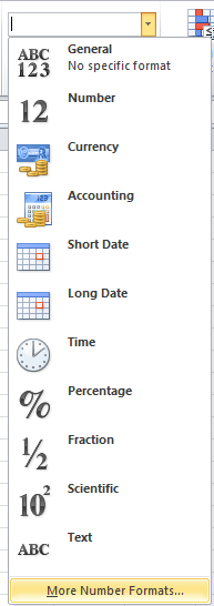
1) Select the cell or cells with the percent change number. In the Excel ribbon number section click the drop down that says General.

2) From the drop down select More Number Formats… at the bottom of the list. You can also select the cell and use hot keys (Ctrl + 1) to get to the number format window in step 3.
3) From the custom formats you paste in the values below in the Type box.
If an increase is good and a decrease is bad copy and paste this in the type box
[Green]▲ 0.00%;[Red]▼ -0.00%
If an increase is bad and a decrease is good copy and paste this in the type box
[Red]▲ 0.00%;[Green]▼ -0.00%
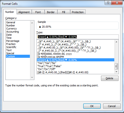
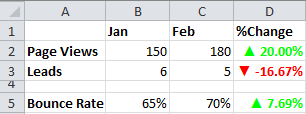
4) Your custom formatting will look like this in your Excel Sheet. In this example an increase in page views is good so that is why the 20% increase in page views is shown in green with an up arrow.
How to Format Percent Change in Google Sheets
Now that we’ve calculated our percent change and added formatting to visualize our data in Excel let’s format our percent change in Google Sheets. See the video and instructions below.
1) Select the cell or cells with the percent change number. In the top nav menu go to: Format> Number> More Formats> Custom Number Format.
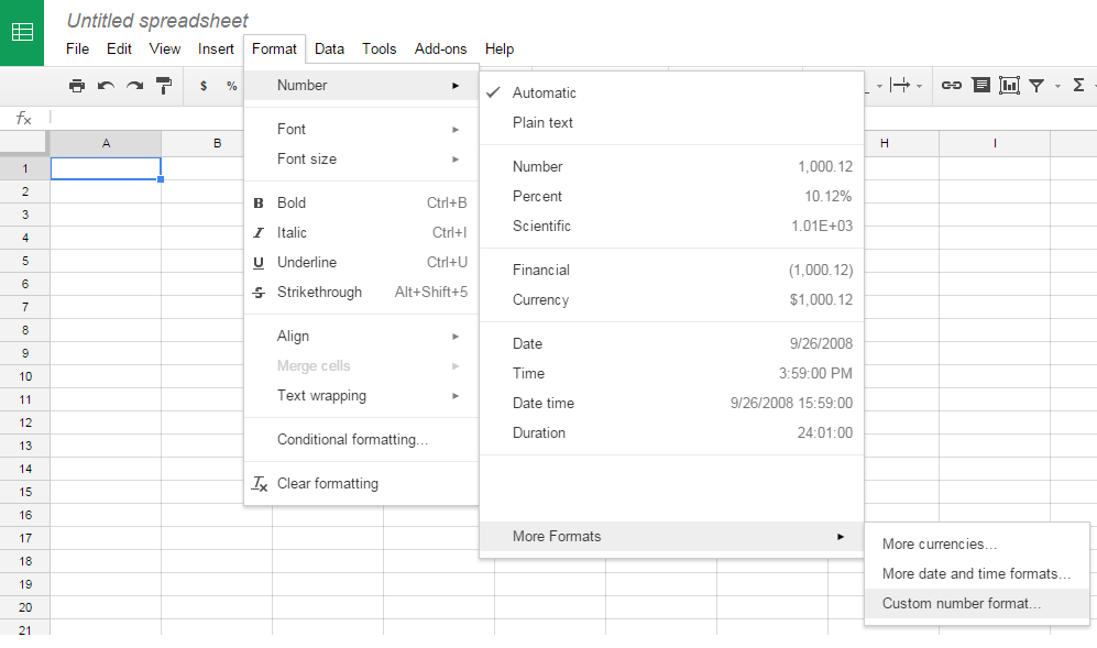
2) From the custom number formats window you paste in the values below in the text box and click apply.
If an increase is good and a decrease is bad copy and paste this in the text box
[Green]▲ 0.00%;[Red]▼ -0.00%
If an increase is bad and a decrease is good copy and paste this in the text box
[Red]▲ 0.00%;[Green]▼ -0.00%
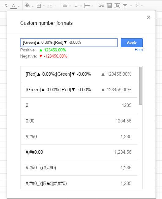
3) Your custom formatting on the change in percent will look like column D below. In this example an increase in bounce rate is bad so that is why the 7.69% increase in bounce rate is shown in red with an up arrow.

Be sure to check out my other Excel and Google Sheets Tips & Tricks post on how to format time metrics from Google Analytics and Adobe Analytics. Let me know if you have any questions in the comments or contact me on Twitter @ryanpraski.