This is a tutorial on how to use R to directly connect to and extract data from Google Analytics using the Google Analytics Reporting API v4. This is meant to be a simple example and assumes no prior knowledge or experience with R, APIs or programming.
I’ve included a video that walks you through each step of the process. You will be up and running in a few minutes. By the end of this tutorial you will be able to:
•Extract page view data for your top pages from Google Analytics Reporting API to R.
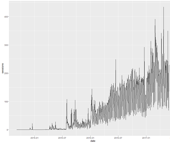
•Create a line graph showing session trended by day using R.
Summary of Steps
1. Install R
2. Install R Studio
3. Save the R Script
4. install.packages(c(“googleAnalyticsR”,”ggplot2″))
5. Authorize googleAnalyticsR to access your data
6. Find your Google Analytics viewID
7. Set your date range dynamically or statically
8. Run page view query
9. View the page view query data View(df1)
10. Run sessions by date query
11. View the sessions data View(df2)
12. Create a line graph of Google Analytics sessions using ggplot2
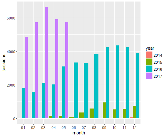
13. Create a bar graph of Google Analytics sessions by month by year using ggplot2
Google Analytics R Video Tutorial
1. Download and Install R
R is a system for statistical computation and graphics. It provides, among other things, a programming language, high level graphics, interfaces to other languages and debugging facilities. Download and install R for Windows, Mac and Linux here: https://cran.r-project.org/
2. Download and Install R Studio
R Studio is where the magic happens. It is an IDE (Interactive Development Environment). This is the software user interface that you’ll be working in and where you’ll run your scripts. Download R studio here: https://www.rstudio.com/products/rstudio/download/
3. Save the R Script
Launch R Studio and in the top menu go to File > New File > New R Script. This will open a blank window in the top left pane of R Studio. Copy and paste the code below into the blank window. Save the R Script.
4. Install googleAnalyticsR and ggplot2 R packages
Packages can be thought of as add-on to R that make it easier to perform your specific task. Much like an Excel plug-in like Analytics Edge or the Google Analytics Sheets add-on. We will be using googleAnalyticsR to connect with and pull Google Analytics data and ggplot2 to visualize the Google Analytics data. In R Studio in the bottom left console paste the code shown below and press enter on your keyboard to install the two packages. Be patient as this may take some time.
> install.packages(c(“googleAnalyticsR”,”ggplot2″))
5. Authorize Google Analytics R to access your account data
Highlight the code shown below and click run in the upper right corner of the top left pane called the source pane.
library(googleAnalyticsR)
library(ggplot2)

#Authorize Google Analytics R- this will open a webpage
#You must be logged into your Google Analytics account on your web browser
ga_auth()
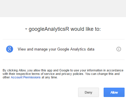
ga_auth() will open your default web browser to a window that will ask you to allow googleAnalyticsR to read your data. Make sure you are logged into the Google Account with access to the Google Analytics data you’d like to query. See the 16 second mark of the video to watch how this authentication process work. Once you’ve authenticated, googleAnalyticsR will remember and you won’t have to reauthenticate on subsequent queries.
6. Find your Google Analytics viewID
Highlight the code shown below and click run in the source pane.
#Use the Google Analytics Management API to see a list of Google Analytics accounts you have access to
my_accounts <- google_analytics_account_list()
View(my_accounts)
This will open the my_accounts dataframe where you will see a table of all the Google Analytics accounts with the corresponding view and viewId that you have access to. Find the the Google Analytics view that you’d like to pull data on and copy the viewId. Paste the numeric viewId on line 13 for my_id replacing my viewId 94579701. Note you can also find your viewId in the Google Analytics admin section of the web user interface.
7. Set your query date range dynamically or statically
Set the date range for your Google Analytics R queries. In the example on rows 16 and 17 I’ve used dynamic dates to set start_date and end_date . You can use dynamic dates like yesterday and 60daysAgo or you can use static date like 2017-01-01 YYYY-MM-DD format.
8. Run the page views query
Highlight the code shown below and click run in the source pane. This will run your page view by pagePath query. The queries use Google Analytics Reporting API v4.
#Page View Query
df1 <- google_analytics_4(my_id,
date_range = c("2016-12-10", "2017-02-07"),
metrics = c("pageviews"),
dimensions = c("pagePath"))
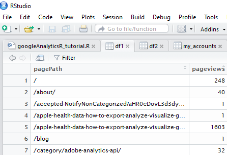
Note that I’ve use static dates for the date_range and I’ve chosen pageviews for the metric and pagePath for the dimension.
9. View the page view data
To view the page view data in a data frame you can find df1 in the top right pane under the Environment tab. Click on df1 and this will open the data frame as a data table in the top left source pane. See the 32 second mark of the video to view this step.
10. Run the session query
Highlight the code shown below and click run in the source pane. This will run your sessions by date query.
#Session Query - Uses start_date and end_date
df2 <- google_analytics_4(my_id,
                          date_range = c(start_date, end_date),
                          metrics = c("sessions"),
                          dimensions = c("date"))
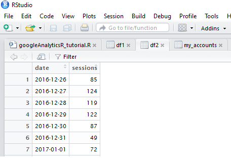
Note that I’ve use dynamic dates for the date_range with start_date and end_date defined on rows 16 and 17. I’ve chosen sessions for the metric and date for the dimension.
11. View the sessions data
To view the sessions data in a data frame you can find df2 in the top right pane under the Environment tab. Click on df2 and this will open the data frame as a data table in the top left source pane. See the 35 second mark of the video to view this step.
12. Create a line graph using ggplot2
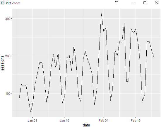
Highlight the code shown below and click run in the source pane. This will create a line graph showing session by date in the bottom right pane under the Plots tab.
#graph sessions by date
ggplot(data=df2, aes(x=date, y=sessions)) +
  geom_line(stat="identity")
13. Create a bar graph of Google Analytics session by month by year using ggplot2
This is a bonus step. A reader asked me how to graph session data by month instead of session by date using ggplot2. He sent me a graph like the one below. Which you can see shows the trend over time but is impossible to answer questions like: Are my Google Analytics sessions up for this month year over year? The steps below will show how to answer this question using a bar graph data visualization in R.
To create the daily line graph over a long period of time (in this case Google Analytics sessions data for the last 1000 days) go to row 16 of the R code and set start_date to 1000daysAgo instead of set 60daysAgo then rerun the sessions query shown in step 8. Then rerun the graph sessions by day code shown in step 12.
Add the code below the ###New Code Starts here### line to your R script and run it to create a bar graph showing Google Analytics sessions data by month by year like the graph below.
Let’s walk through the script and what it is doing. First you need to add a month and year column to your dataframe using the date column from your query. Then you need to include the dplyr package to group the data by month and by year using the new columns.
The code starting on line 43 below takes our dataframe df2 and groups the data by year and month. Then it sums the yearly and monthly sessions data. The print(n=100) on row 47 will print out the yearly and monthly aggregated session data to the R console. Then the ggplot2 portion of the code starting on line 49 will create a bar graph with months on the x axis and session on the y axis and fill of year creating a different color bar graph for each year.
#set date variables for dyanmic date range
start_date <- "1000daysAgo"
end_date <- "yesterday"

#Session Query - Uses start_date and end_date
df2 <- google_analytics_4(my_id,
                          date_range = c(start_date, end_date),
                          metrics = c("sessions"),
                          dimensions = c("date"))

##########################
###New Code Starts here###
##########################

#add in year month columns to dataframe
df2$month<-format(df2$date,"%m")
df2$year<-format(df2$date,"%Y")

#include dplyr library to group data by month and year
library(dplyr)

#sessions by month by year using dplyr then graph using ggplot2 bar graph
df2 %>%
  group_by(year,month) %>%
  summarize(sessions=sum(sessions)) %>%
  #print table steps by month by year
  print (n=100) %>%
  #graph data by month by year
  ggplot(aes(x=month, y=sessions, fill=year)) +
  geom_bar(position='dodge', stat='identity')
Congratulations! You’ve Learned the Basics of Google Analytics R Now What?
Create your own Google Analytics queries. Use the Google Analytics dimension and metrics combination explorer to see dimension and metric names and valid combinations for the reporting API v4.
Check out my tutorial on how to analyze page scroll depth using Google Analytics R.
Check out my tutorial on how to pull Google Search Console data using R.
If you are a Python user check out my tutorial showing you how to pull your first query using the Google API Python library.
Check the great examples provided by the googleAnalyticsR author Mark Edmondson.
Explore Tim Wilson’s tutorial on his Shiny Google Analytics R Traffic Explorer Application.
Please let me know if you have any questions or need any help getting Google Analytics R working for you in the chat or comments below.

