Google Analytics Reporting API Python Tutorial

• Download Python 2
Register your application for the Analytics API in Google Developers Console 
Download the Google Python API Sample Code
Google Analytics Query Explorer
Python Code to Output Google Analytics API Query Data to CSV *save file as .py

Check out this new post on how to pull over 1 million rows of unsampled data using Python & how to pull data from multiple profiles

Check out this new post on how to pull more than 10000 rows of unsampled data using the Google Analytics Sheets Add-on.

R users check out this tutorial on how to pull your first Google Analytics R v4 reporting API query.

This guide will go through step by step instructions on how to setup Python and pull your first query directly from the Google Analytics reporting API. I will show you how to install Python on Windows and add the Google API Python library. We will create a new project in the Google Developers Console and enable the Analytics API. Next we will use a prebuilt sample Python application to get data out of Google Analytics via the API. Then I’ll walk you through how to test your own query using the Google Analytics Query Explorer. Then we will edit the Python application code to create your very own query. And finally we will pull Google Analytics data directly into Excel using Python to write a CSV file containing the Google Analytics data.
Continue Reading

How to Add 100 Users to Adobe Analytics in Seconds

Adobe_Analytics_API_Add_Multiple_Users

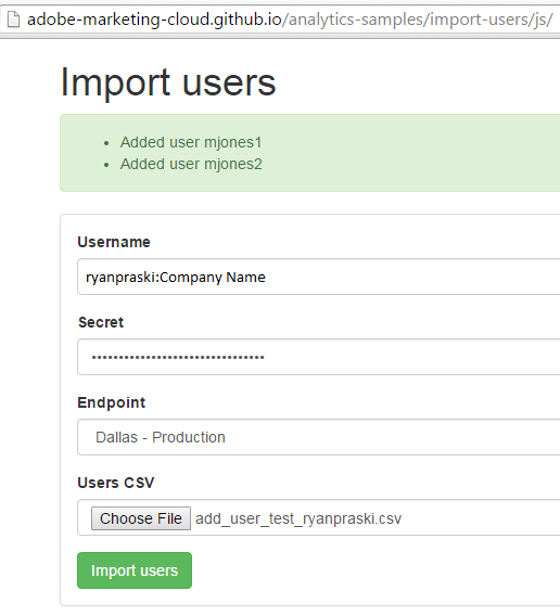
Website to add multiple users
Sample CSV file to upload to the website

The Problem: How to add 100 users to Adobe Analytics as efficiently as possible?

A client recently requested that I add 100 new users to an Adobe Analytics account. I didn’t want to go in and add each user one by one via user management in the administrative console. It could take an hour or more to fill in the required fields for each of the 100 users. Administrative upkeep and user management is tedious work that is prone to errors. There had to be a better way.

The Solution: Use a web application that leverages the Adobe Analytics API

Continue Reading

How I found my Career in Digital Analytics on Craigslist 7 Years Ago

semphonic_staff_xchange_2010_monterey_ca

Semphonic Staff at XChange 2010 Monterey California

Digital Analytics is an amazing field. I am so lucky to have found something so interesting so early in my career. Like most web analytics professionals I didn’t plan on being a web analyst. In fact before I started searching for a new job in spring of 2008 I had never heard of web analytics. In my 7 year web analytics career I’ve been fortunate to work for Semphonic and for the last 2 years plus Ernst & Young following the acquisition of Semphonic in March 2013. Thankfully Gary Angel and Joel Hadary hired me in July 2008. I’ve been lucky to have Paul Legutko as my mentor, manager and my professor of digital analytics for the entire 7 years. When people ask me about Paul I describe him as the professor that you wished you had in college: smart, patient, funny, willing to take the time to answer your questions and truly an amazing teacher. (Before web analytics Paul spent time teaching and doing post-doctoral research at the University of Michigan and Stanford University). I can’t believe it has been 7 years. Before too much more time passed I wanted to make sure to recount how I got into digital analytics. I responded to Semphonic’s Craiglist job post and the rest is history. Here is the story.

Continue Reading

Format Percent Change Red & Green- Excel & Google Sheets for Digital Analytics: Tips & Tricks

google_sheet_percentage_change
If an increase is good and a decrease is bad format percent change like this
[Green]▲ 0.00%;[Red]▼ -0.00%

If an increase is bad and a decrease is good format percent change like this
[Red]▲ 0.00%;[Green]▼ -0.00%

Download Excel Sample

Google Sheet Sample

You are putting together a report or dashboard and you want to make it simple to understand changes in metrics. By adding color and arrows to a percent change you can help better visualize the meaning of the data. This post shows you how to add green and red color and up and down arrows to highlight changes in metrics in Excel and Google Sheets.

Continue Reading

From Web Analytics to Scheduling Meetings?

Digital Analytics Association NYC Symposium 2015

daa_syposium_nyc
Last week I attended my first Digital Analytics Association (DAA) Symposium in New York City. The theme of the Symposium was “Beyond Measure” how we’re using our own and others’ data in ever-more imaginative ways to create new products, experiences and possibilities for consumers and businesses. This theme really resonated with me. In our day to day work as digital analysts we are often very heads down. We focus on implementing, reporting and analyzing digital data, but less time thinking about bigger picture uses of data. The keynote by Dennis Mortensen of x.ai a personal assistant that let’s you schedule meetings via email using artificial intelligence was inspiring. This post will tell Dennis’ story about going from founding two digital analytics companies to founding a company that schedules meetings.

Continue Reading

Format Time on Page- Excel & Google Sheets for Digital Analytics: Tips & Tricks

• Download Excel Sample
• Google Sheet Sample

4.33 -> 04:20 Adobe Analytics
179.04 -> 02:59 Google Analytics

When you pull metrics like average time on page from digital analytics tools the number format looks like this: 4.33

I remember scratching my head the first time I saw this in Adobe Analytics (then Omniture). Was the other dot in the colon missing and did this mean 4:33 or 4 minutes 33 seconds? Or did this actually mean 4 minutes 0.33 * 60 seconds (0.33 multiplied by 60) which equals 4 minutes 19.8 seconds?

average_time_on_page_adobe_analytics

Average Time on Page in Adobe Analytics Report & Analytics

Drum roll please… it means 4 minutes 0.33 * 60 seconds or 04:20. For those of you who were able to convert 4.33 from an a number with a decimal to time in your head please pat yourself on the back and let me know in the comments. For the rest of us, this post will show how to convert a number with decimal time to minutes and seconds time formatting using Excel and Google Sheets.

Continue Reading

Using the Adobe Analytics API for Report Suite Configuration

adobe_analytics_api_explorer

Last updated on August 9, 2018

In July 2018 Adobe took down the Developer Connection site tools and content that included the Adobe Analytics API Query Explorer, code samples, documentation and the developer forum. All of the Adobe Analytics API tools, documentation and samples have been moved to GitHub. To replace the Adobe API Query Explorer use Postman and the Adobe Analytics API Postman guide. If you have questions about the Postman setup let me know. Once you are setup you can follow the rest of this tutorial and use Postman instead of the Adobe API Query Explorer.

This post describes an actual situation I found myself in when setting up a new report suite in Adobe Analytics. In options 1-3 I go over standard administrative console based options for copying settings between report suites. In option 4 I introduce another option that uses the Adobe Analytics API. I recommend perfecting the Adobe Analytics API report suite configuration and usage on a test report suite first before applying what you’ve learned to a production report suite.

Check out my new post on How to Add 100 Users to Adobe Analytics in Seconds for information on how to use a web application that leverages the Adobe Analytics API to add multiple users fast.

Continue Reading

Top 3 Takeaways From The X Change 2014 Conference

xchange_phoenician_hotel

X Change 2014 Phoenician Resort Scottsdale, AZ


The X Change digital analytics conference is always a highlight of the year. In its 8th edition, the conference gathered a group of the top enterprise analytics practitioners from companies like Nike, Vanguard, Facebook and Adobe at the Phoenician Resort in Scottsdale, Arizona. What continues to set X Change apart from other conferences is the intimate interactive huddle format. Between 10 and 20 attendees huddle up (football pads optional) on topics like: “Taking all the Credit: The Promise of Marketing Attribution Technology” and “Data Integration: The Good The Bad and The Ugly”. You can see a full list of the huddles here. A huddle leader is assigned to each group discussion, but that person’s role is to facilitate and guide the discussion, rather than speak at the participants. What follows is an honest discussion about what has worked as well as challenges and questions different organizations are facing. I’ve been lucky enough to attend X Change the last 6 years as a member of Semphonic and now the EY team and I want to share my top 3 takeaways from the X Change 2014 conference with a bonus takeaway at the end of the post.

Continue Reading