Apple Health Data How to Export Analyze Visualize Guide

apple_health_kit_steps_by_day_of_week_r_graph

Introduction

Did you know that the Apple Health App is recording your steps, mileage, and flights climbed data? This post will show you how to export, analyze and visualize your Apple Health data using both Excel and R. But first let’s establish that you may be sitting on a mountain of personal fitness data on your iPhone without even knowing it.

Send me your Apple Health export.xml file and I’ll analyze your fitness data for you.

Contents
Introduction
Export Apple Health App Data
Transform Apple Health XML to CSV
Analyze and Visualize Apple Health Data in Excel
Analyze and Visualize Apple Health Data in R

On iPhones 5s and newer and iOS 8 and newer, the health data is automatically collected as long as you have your iPhone with you when you are walking, running or hiking. Senors on the iPhone including the gyroscope, accelerometer, GPS, and barometer are used to measure steps, miles and flights climbed. To access the Apple Health data find and tap the heart health icon in your applications shown below. Your quantified self data is already being captured and you may not even know it.

AppleHealth_icon_

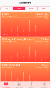
By default your Health dashboard should launch. If not tap the Dashboard icon on the bottom navigation. The dashboard will look like the screen shot shown below.

apple_health_dashboard

If you tap on any of the graphs twice, the first tap will bring you to a screen with a graph of just the single metric i.e. steps, and the second tap will launch a detailed table view of the data by day. This gives a nice quick view of your health data, but it makes it difficult to answer questions such as:

How do my steps this month compare to the same month to last year?
Am I more or less active on the weekdays or weekends?

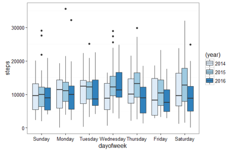
The boxplot below shows my steps data by day of the week by year. This visualization was created using R and is just one example of what you will learn to create in this post.

apple_health_kit_steps_by_day_of_week_r_graph

This post will show you how to answer these questions and get started exporting, analyzing and visualizing your Apple Health steps, walking and running distance and flights climbed data.
Continue Reading

Google Analytics Reporting API Python Tutorial

• Download Python 2
Register your application for the Analytics API in Google Developers Console 
Download the Google Python API Sample Code
Google Analytics Query Explorer
Python Code to Output Google Analytics API Query Data to CSV *save file as .py

Check out this new post on how to pull over 1 million rows of unsampled data using Python & how to pull data from multiple profiles

Check out this new post on how to pull more than 10000 rows of unsampled data using the Google Analytics Sheets Add-on.

R users check out this tutorial on how to pull your first Google Analytics R v4 reporting API query.

This guide will go through step by step instructions on how to setup Python and pull your first query directly from the Google Analytics reporting API. I will show you how to install Python on Windows and add the Google API Python library. We will create a new project in the Google Developers Console and enable the Analytics API. Next we will use a prebuilt sample Python application to get data out of Google Analytics via the API. Then I’ll walk you through how to test your own query using the Google Analytics Query Explorer. Then we will edit the Python application code to create your very own query. And finally we will pull Google Analytics data directly into Excel using Python to write a CSV file containing the Google Analytics data.

Continue Reading

Format Percent Change Red & Green- Excel & Google Sheets for Digital Analytics: Tips & Tricks

google_sheet_percentage_change
If an increase is good and a decrease is bad format percent change like this
[Green]▲ 0.00%;[Red]▼ -0.00%

If an increase is bad and a decrease is good format percent change like this
[Red]▲ 0.00%;[Green]▼ -0.00%

Download Excel Sample

Google Sheet Sample

You are putting together a report or dashboard and you want to make it simple to understand changes in metrics. By adding color and arrows to a percent change you can help better visualize the meaning of the data. This post shows you how to add green and red color and up and down arrows to highlight changes in metrics in Excel and Google Sheets.

Continue Reading

Format Time on Page- Excel & Google Sheets for Digital Analytics: Tips & Tricks

• Download Excel Sample
• Google Sheet Sample

4.33 -> 04:20 Adobe Analytics
179.04 -> 02:59 Google Analytics

When you pull metrics like average time on page from digital analytics tools the number format looks like this: 4.33

I remember scratching my head the first time I saw this in Adobe Analytics (then Omniture). Was the other dot in the colon missing and did this mean 4:33 or 4 minutes 33 seconds? Or did this actually mean 4 minutes 0.33 * 60 seconds (0.33 multiplied by 60) which equals 4 minutes 19.8 seconds?

average_time_on_page_adobe_analytics

Average Time on Page in Adobe Analytics Report & Analytics

Drum roll please… it means 4 minutes 0.33 * 60 seconds or 04:20. For those of you who were able to convert 4.33 from an a number with a decimal to time in your head please pat yourself on the back and let me know in the comments. For the rest of us, this post will show how to convert a number with decimal time to minutes and seconds time formatting using Excel and Google Sheets.

Continue Reading